NYU+NASA Design Workshop
This is a project that comes out of a two-months design workshop between NASA Jet Propulsion Laboratory ( JPL ) and NYU Tandon School of Engineering.
Instructors

Dana Karwas
Lecturer of Integrated Digital Media at NYU Tandon School of Engineering


Matthew Clausen
Marijke Jorritsma
Creative Director of Immersive Visualization at NASA Jet Propulsion Laboratory, Design Lead for ProtoSpace
UX Designer at NASA Jet Propulsion Laboratory, Ops Lab
Design Team
Group Member
Najma (Product Manager)
Rose Bender (UX Designer)
Lexus (UX Designer)
Joseph (UX Designer)
Ariana (UI Designer)
My Role
Interaction Design
UX Research
UI Prototype
Design Tools
Cardboard
Google Tilt Brush
Blender
Unity
Introduction to ProtoSpace
ProtoSpace is an augmented reality application developed by the JPL Ops Lab to assist NASA’s engineers in design and assembly of spacecraft. Within ProtoSpace, users are able to select and manipulate (hide or move) parts of the spacecraft.

Engineers use ProtoSpace in a meeting
(Photo credit: NASA JPL)
Design Challenge
In this project, we were given two challenges from the JPL client team:
- Design a way to navigate through CAD model file hierarchy in augmented reality
- Figure out how to communicate the design to the ProtoSpace team.

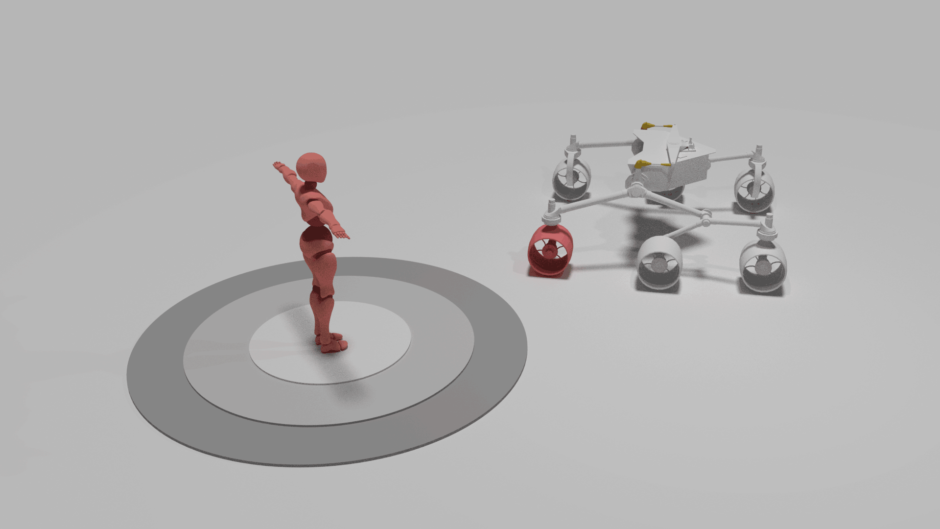
Example of the file Hierarchy in 2D space
(Photo credit: NASA JPL)
Design Process
Emphasize
The first challenge that we have is to get to know our target users, which are the mechanical engineers in NASA.
Due to confidential issues, we could not directly contact them, but could only communicate with the UX researcher and design lead in JPL and get their insights.
In this process, our team felt like there were too many missing pieces for us to understand the workflow of mechanical engineers.To change this situation, we reach out to people who also frequently work with CAD model and interview them. We also contact the mechanical engineer students who currently work in NASA Robotics team and get to learn more about the workflow of mechanical engineers with CAD model.

Engineer showed us his habit of using CAD application

Engineer described how he imagined the interface would be
Define
Through communicating with clients and conducting interviews, we had the following gains:
1. Identified user case: From our clients, we got that there were two typical use cases. The first was to use ProtoSpace to support a collaborative discussion about the model with colleagues. The second was to use ProtoSpace as a presentation tool.
2. Identified users' habits with CAD desktop application: Observing users' workflow helped us a lot in terms of understanding what Hololens could help.
After the first round of user research, we further divided the design challenges into the following session:


How to display
long texts in 3D space?
How to quickly display
parent-child relationship
in file hierarchy?
What movements/gestures
do users use for navigation?
Ideation
During the whole process, we had come up with different designs concepts for the user interface.
At this time, we came across our second challenge, which was narrowing down the ideas that we had and selected one direction to go down. Below are the three ideas that we discuss most at the end of ideation process.
Display parent-child relationship in the form of "Onion Rings"
Display text on "Onion Rings"

Move in space to control user interface

Display parent-child relationship on the wheel
Display text on extended window
Air Tapping
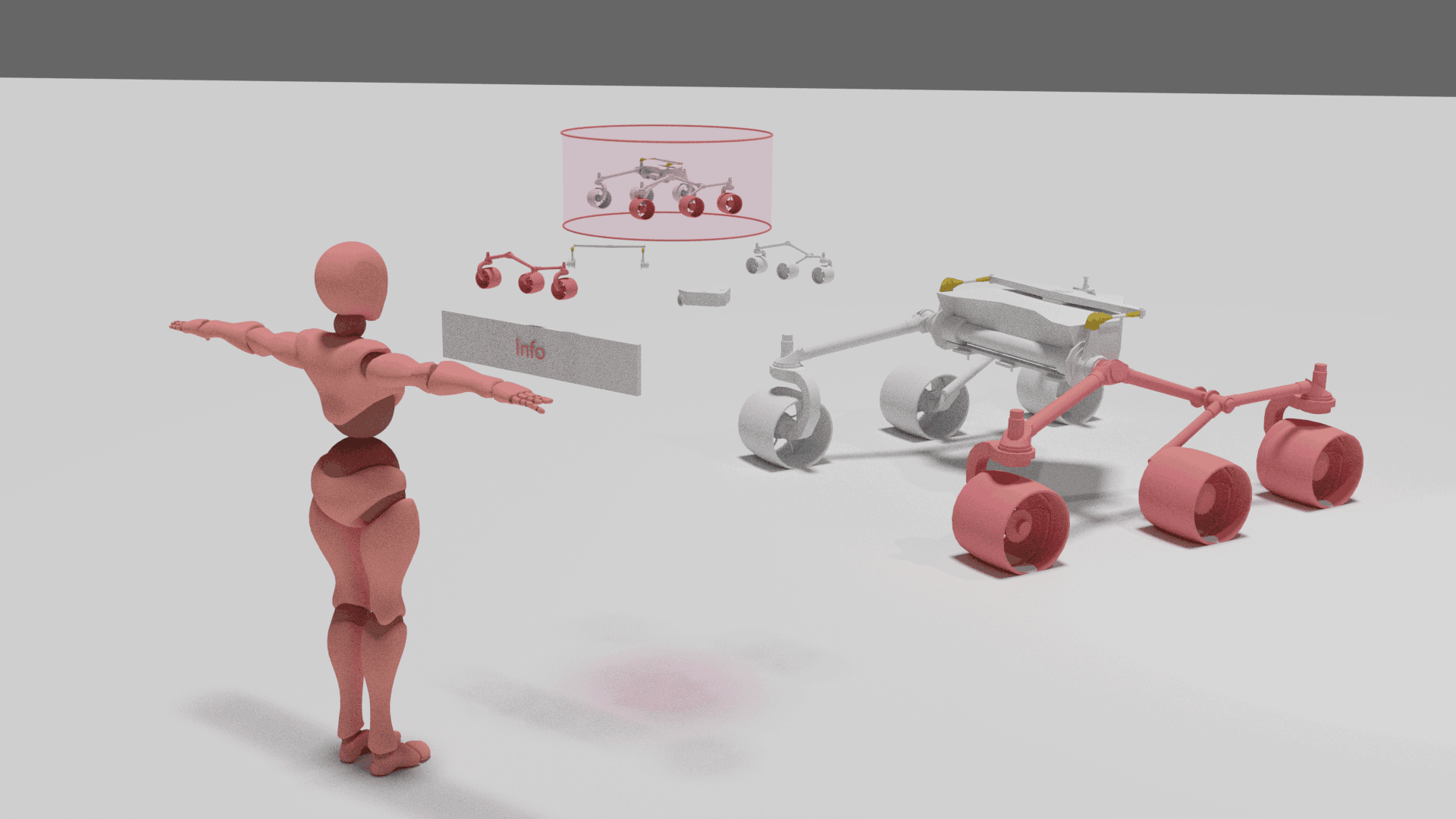
Display parent-child relationship on the tube
Display text below selected object
Air Tapping
(Credit: Curiosity Mars Rover model used above was downloaded from NASA )
Prototyping and Testing [First Round]
To figure out which direction we should go down, we decided to prototype and test these ideas to better understand the advantages and disadvantages of each design. Lexus in our team built
a cardboard "headset" to help us better simulate the currently limited field of view of HoloLens.


Through prototyping and testing, we eventually chose the third design based on the following reasons:
1. Relatively appropriate distance and size
Through testing, we quickly realized that we had to be mindful of the size of the user interface and the distance between users and the interface. For example, due to the limited field of view of the current version of HoloLens, the first design required users to constantly move their body and switch their views between the interface and view target(CAD Model), thus causing fatigue and unpleasant feelings. Therefore, we chose to move away from this design.
2. More in line with the use scenario of ProtoSpace
Based on previous interviews, ProtoSpace is mainly used in collaborative discussions or used as a presentation tool. In other words, it is used in a group environment that requires shared information. Comparing the second and the third design, we believed that the third design had better system visibility towards all participants in the ProtoSpace Session.
In conclusion, we decided to select the last design. And we named it the "Totem".
Selected
Define User Flow

Choose "Totem Select" tool from toolbar

Air tap to open the first hierarchy of the Totem

Click and drag to scrub through the objects in the first hierarchy
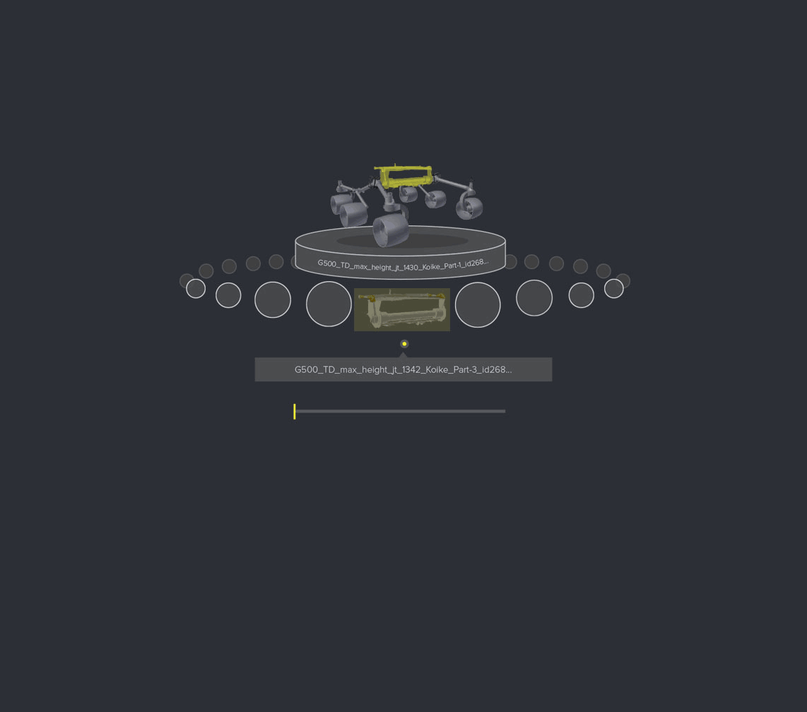
Select target object
(Credit: The original 2D mockups were created by Ariana in our team. I simply animated it.)
Prototyping and Usability Testing [Second Round]
To further test the usability of this system, I prototyped the user interface in Unity for HoloLens. Our team invited several users, including mechanical engineer students from NASA Robotic team to conduct a usability test.

Scrub to select item
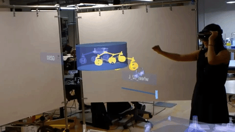
View from another HoloLens

Engineer student from NASA Robotics team joined us for usability testing
Analyze and plan for next step
Through testing in HoloLens, we realized some other issues that came with AR UI design.
(1) Interaction
The way to quickly jump between different hierarchy and the visibility of the system received positive feedback. Users could easily understand how to use the interface. However, users reported that using "click and drag" to scrub through objects could easily become a tiring gesture.
(2) Visual
Users noticed that sometimes the UI would blend into the environment. This reminded us to be more careful of the typography, color, and transparency used in UI elements.
In our next step, we plan to explore deeper in the above area.