AnatomyX
AnatomyX is a mobile augmented reality anatomy education application. It aims to create a revolutionary anatomy learning experience for students, teachers, and anyone interested in learning more about the human body.
Group Member
Chris Morley (Product Manager)
Wenbo Lan (Software Developer)
Jerry Lei (Software Developer)
My Role
Interaction Design
UX Research
UI Prototype
Design Tools
Sketch
InVision
Unity

Three Core Modes

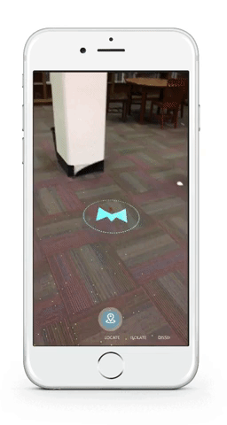
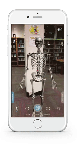
Locate
Dissect

Isolate
Place the body in any real-world environment
Visualize structures independently to learn key information
Remove structures and peel away layers to understand anatomy
Dual-Navigation

System-based
Region-based
15 systems of
human anatomy
8 Regions of
human anatomy
Project Background
AnatomyX was originally an anatomy education application aiming for HoloLens platform. As Apple released ARKit this summer, MediVis decided to initiate the project for its mobile version. After a software engineer made the first rough version, I was brought to lead the UX initiatives for this project.
At this time, all the UI elements were migrated from HoloLens version and functions were still very limiting.
Information Architecture I created for the first version of AnatomyX
I believe that in order to get better answers, I would need to find better questions. So I began my first round of discovery process.

Discovery
My first step was trying to understand the business goal of this product. So I set up a discussion with the product manager and the CEO to get their perspectives. From our conversations, I learned that they believed that the release of iPhone 8 and iPhone X would significantly improve the accessibility of AR technology. Thus the mobile AR product could help the company achieve the following business goals:

After that I briefly checked out most of the existing anatomy applications in the app store. And I chose the following three apps to conduct competitor reviews.


Based on the previous discovery, I drafted out a rough new version of the mobile AnatomyX.


At this stage, there were two questions that I had in mind:
What are medical students’ experiences with the existing anatomy education applications?
What contents do medical students care more about / be willing to pay for?
User Interview
In the early user research process, our team reached out to 4 medical students and conducted phone interview with them. Later we also had in-depth contextual interviews with another 6 medical students at NYU Langone’s Tisch Hospital.

Daily routine of a NYU medical student taking anatomy lessons.
Unlike the HoloLens version, which also aspires to revolutionize the classroom experience, the mobile version of AnatomyX mainly aims to improve medical students’ self-learning experience. Through user research, we hoped to find out the gap/pain points between lectures and cadaver lab. And here were our findings about what troubles medical students:

Based on these findings, I iterated on my first version of design and made the following mockup.
Then how are existing anatomy education application helps with these pain points?
During the interview, we realized the actual usage rate of anatomy education app is relatively low and the reasons are as follow:
1. Prefer other mediums:
Prefer hands-on experiences in the lab. Prefer reading flashcards/atlas.
2. Usability Issues:
Complicated interface. Difficult to manipulate the model.
3. Lack of Contents:
Could not find certain parts that are important in the body model. Could not find other useful medical information like radiology/histology information.
User Testing
At this point, our team felt like it was time to conduct usability testing with medical students. So we created a screening survey and eventually recruited 11 medical students with different background.


These are the key findings from user testing sessions:
1. Users did not get used to "use the phone to aim" select method, especially users who were not familiar with VR/AR:
During the testing, many users tried to tap the screen to select parts instead of moving the phone to aim at parts.
2. Users were more impressed by the capability to add a dimension of their control to freely view the body than the ability to anchor the body on the certain surface:
Users expressed that being able to freely move the phone to go through structures of the body was much better than the traditional 2D experiences of "pinch/mouse zoom and move" on screen.
3. When a menu item is out of sight, it is out of mind:
We originally assumed that expand/explode function was more a fun experience instead of an educational experience, so we put the expand function into the "hamburger" menu along with other adjust features. But students did express how this function could be useful for them. And when the function was in the "hamburger" menu, users were most likely to ignore it.